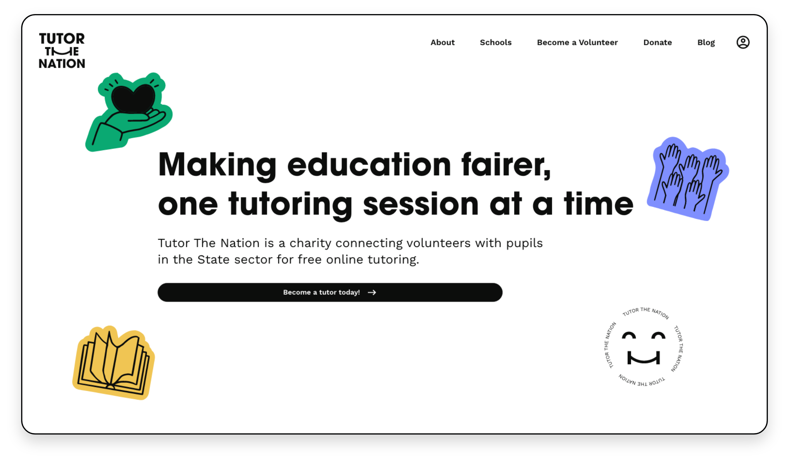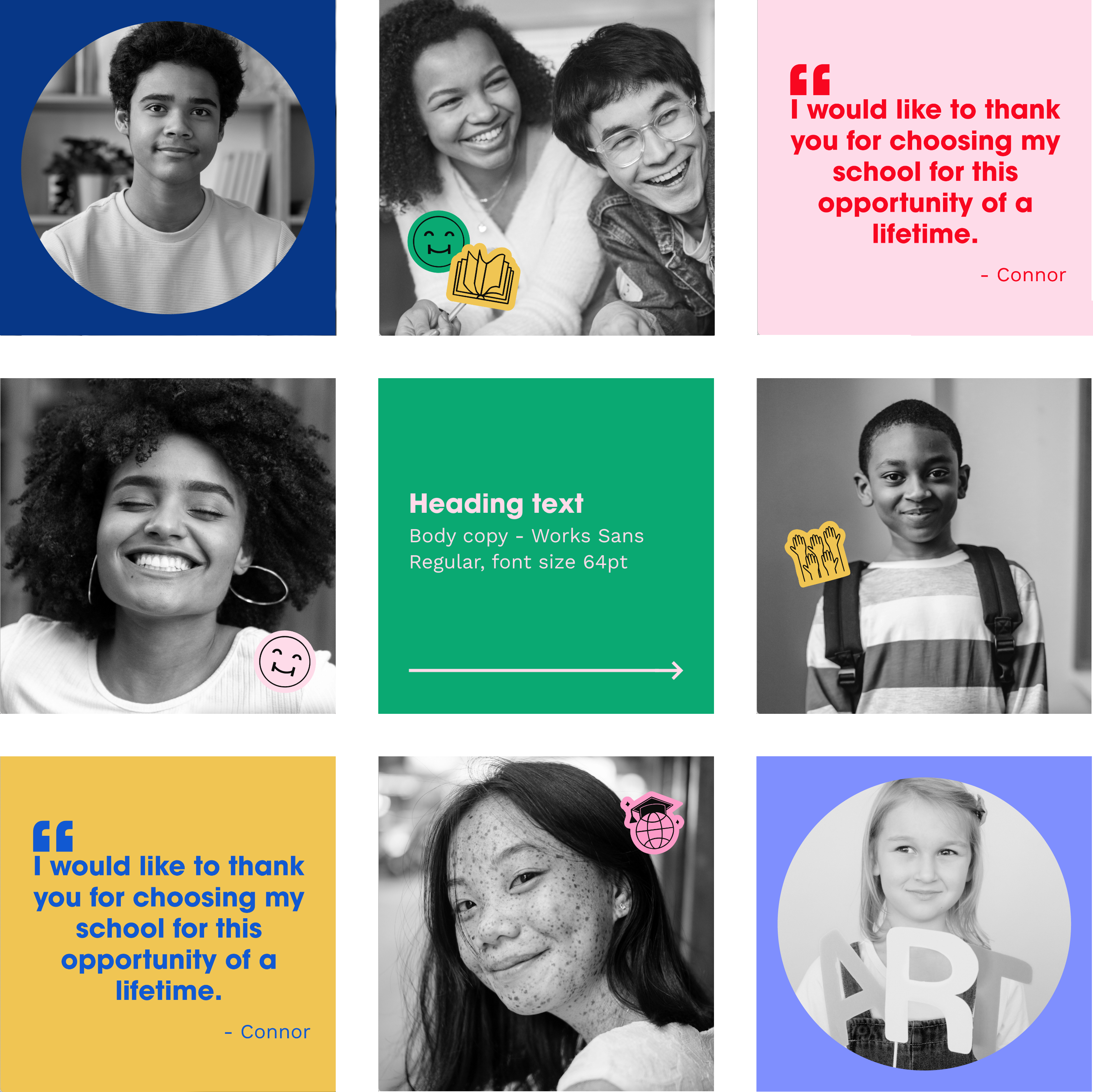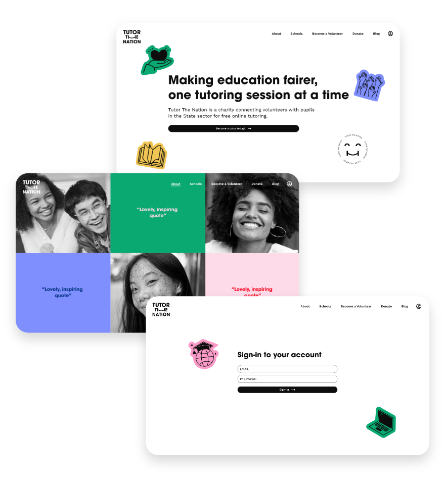
Tutor the Nation
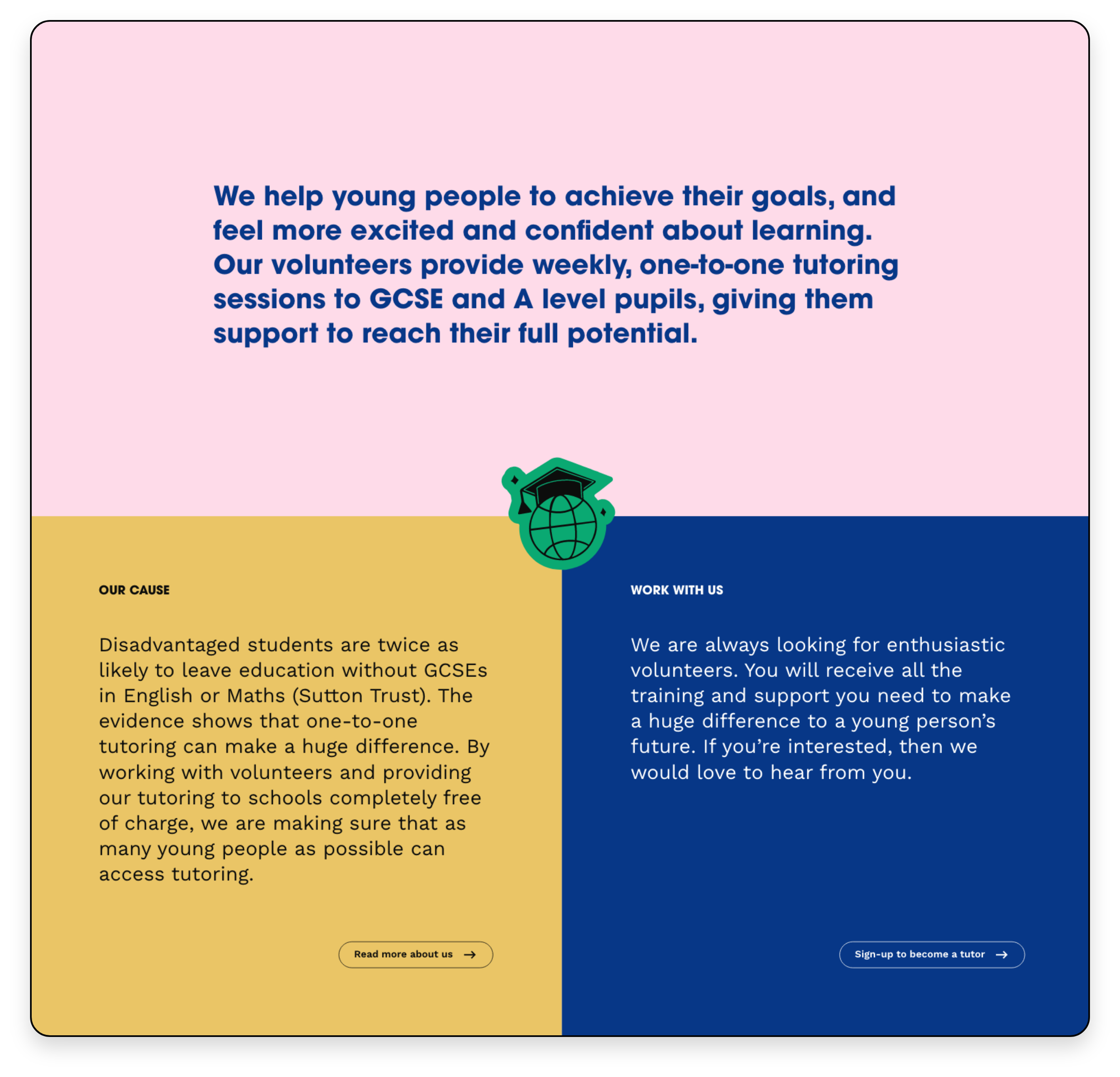
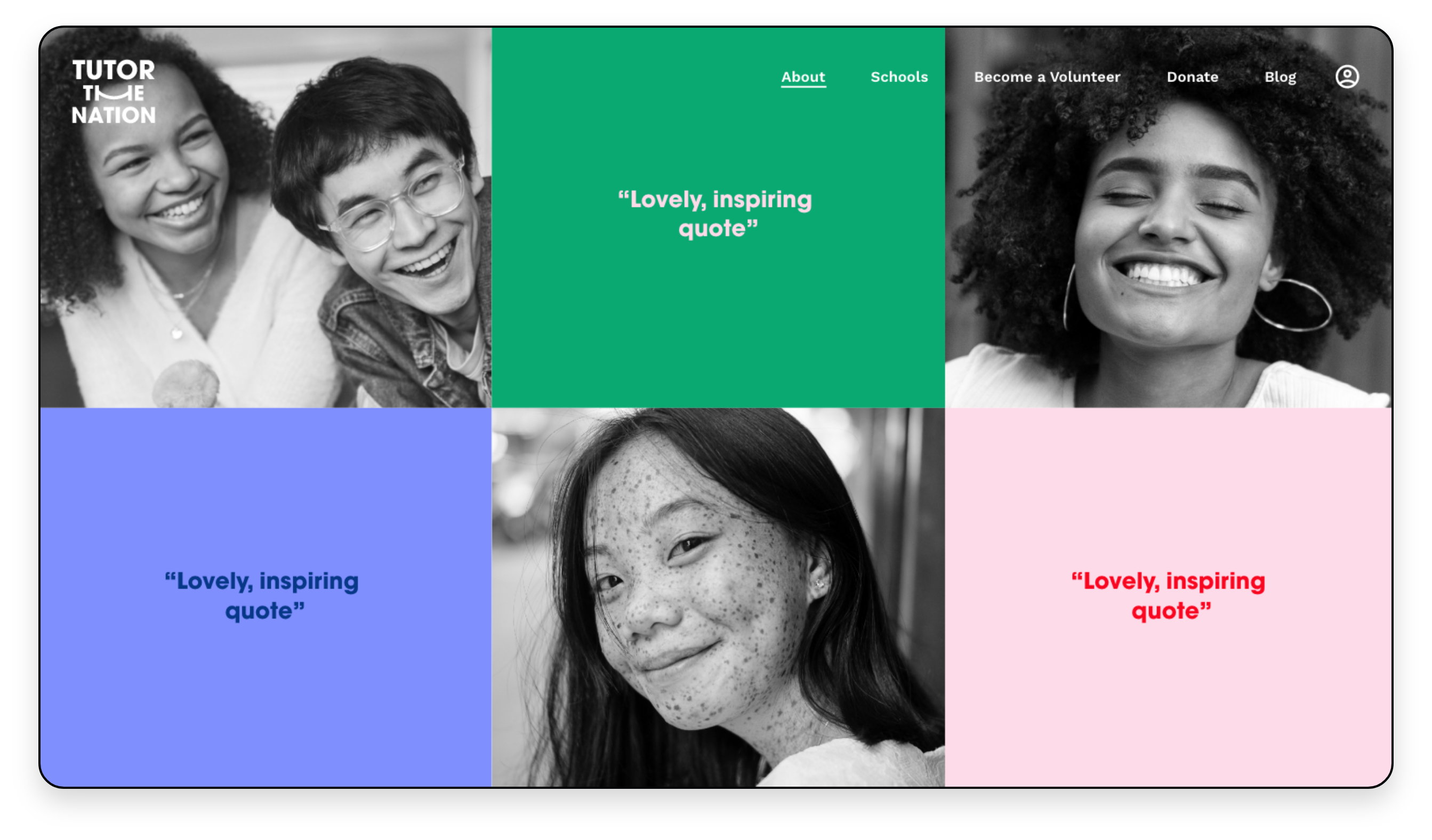
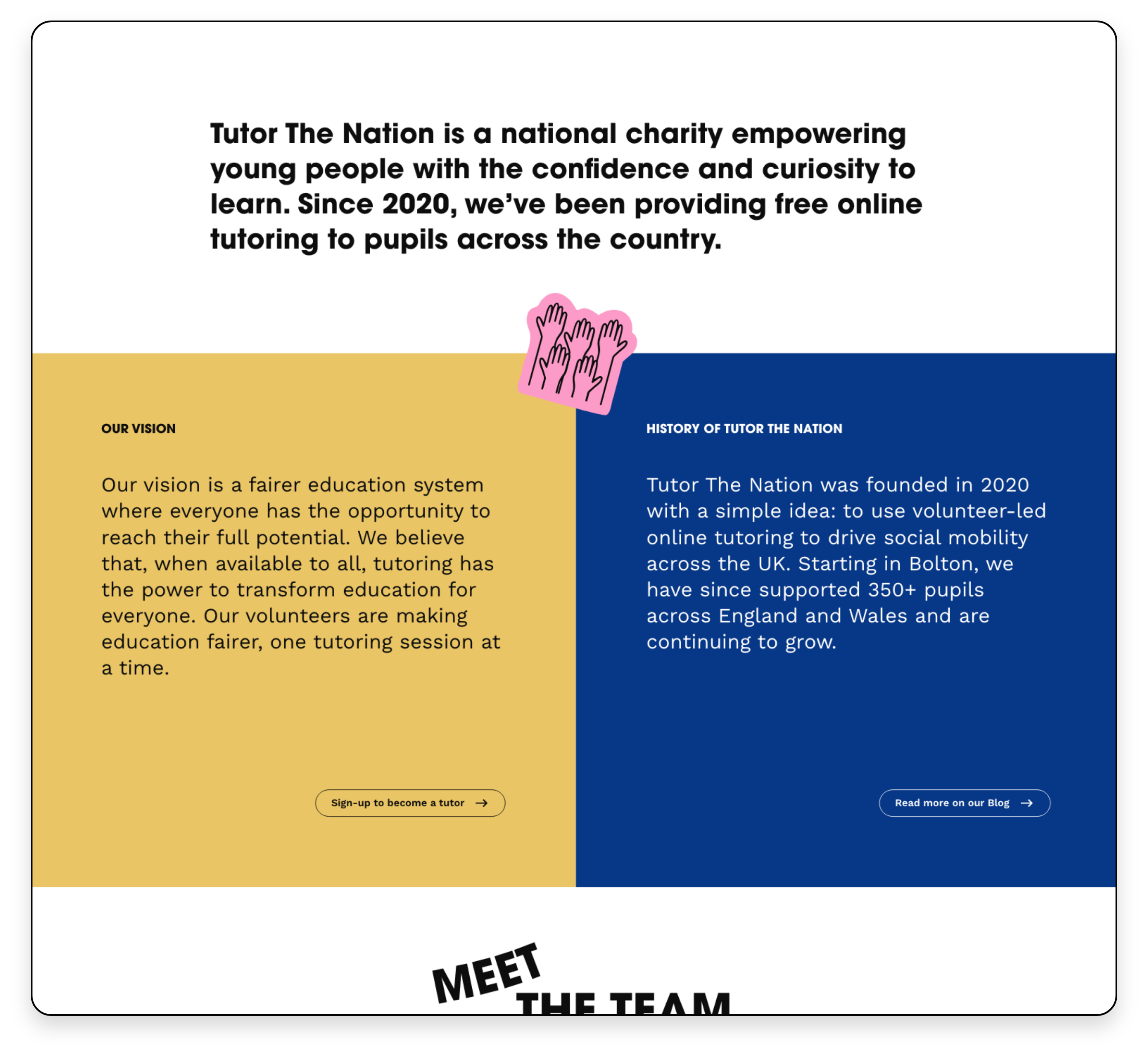
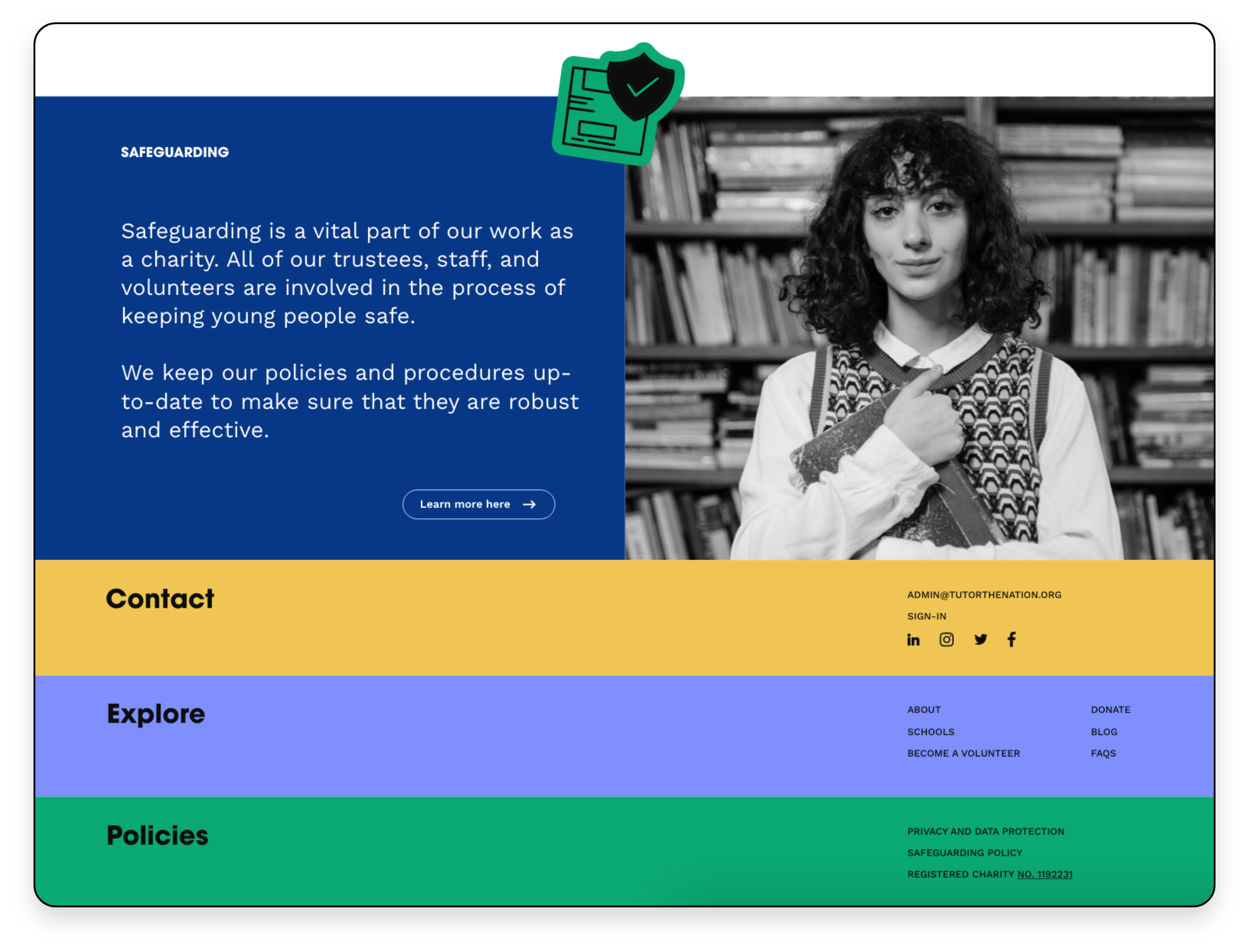
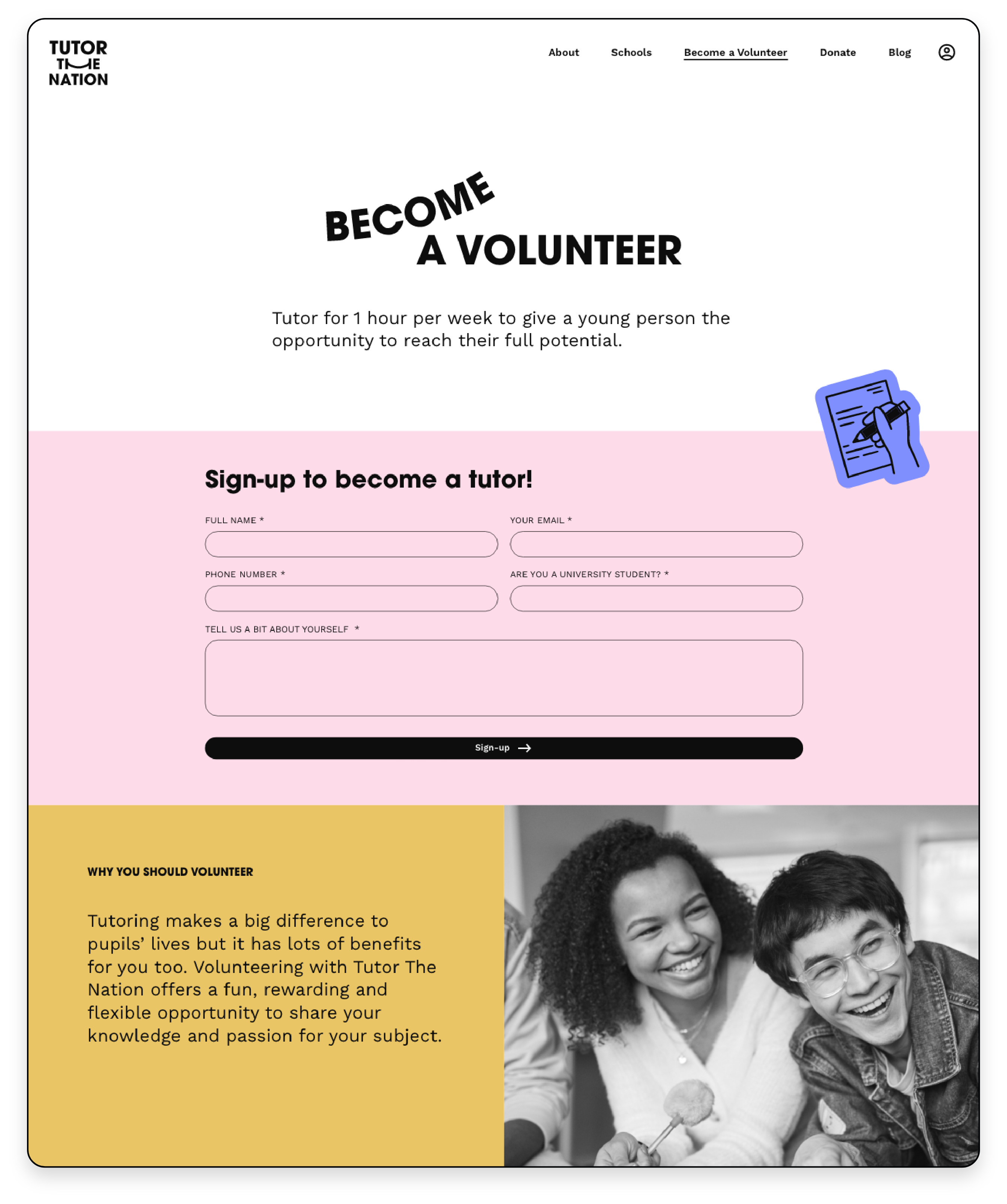
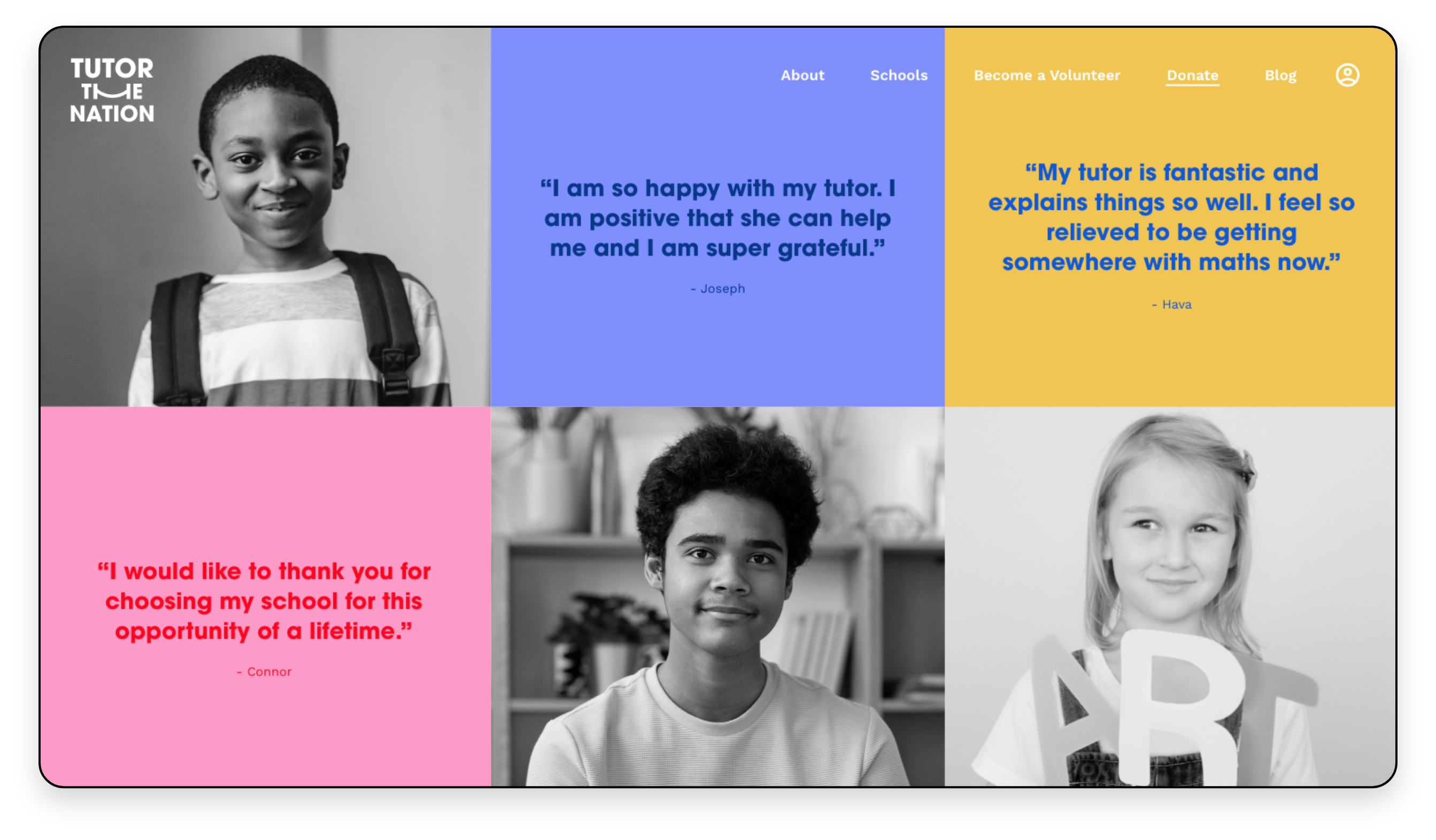
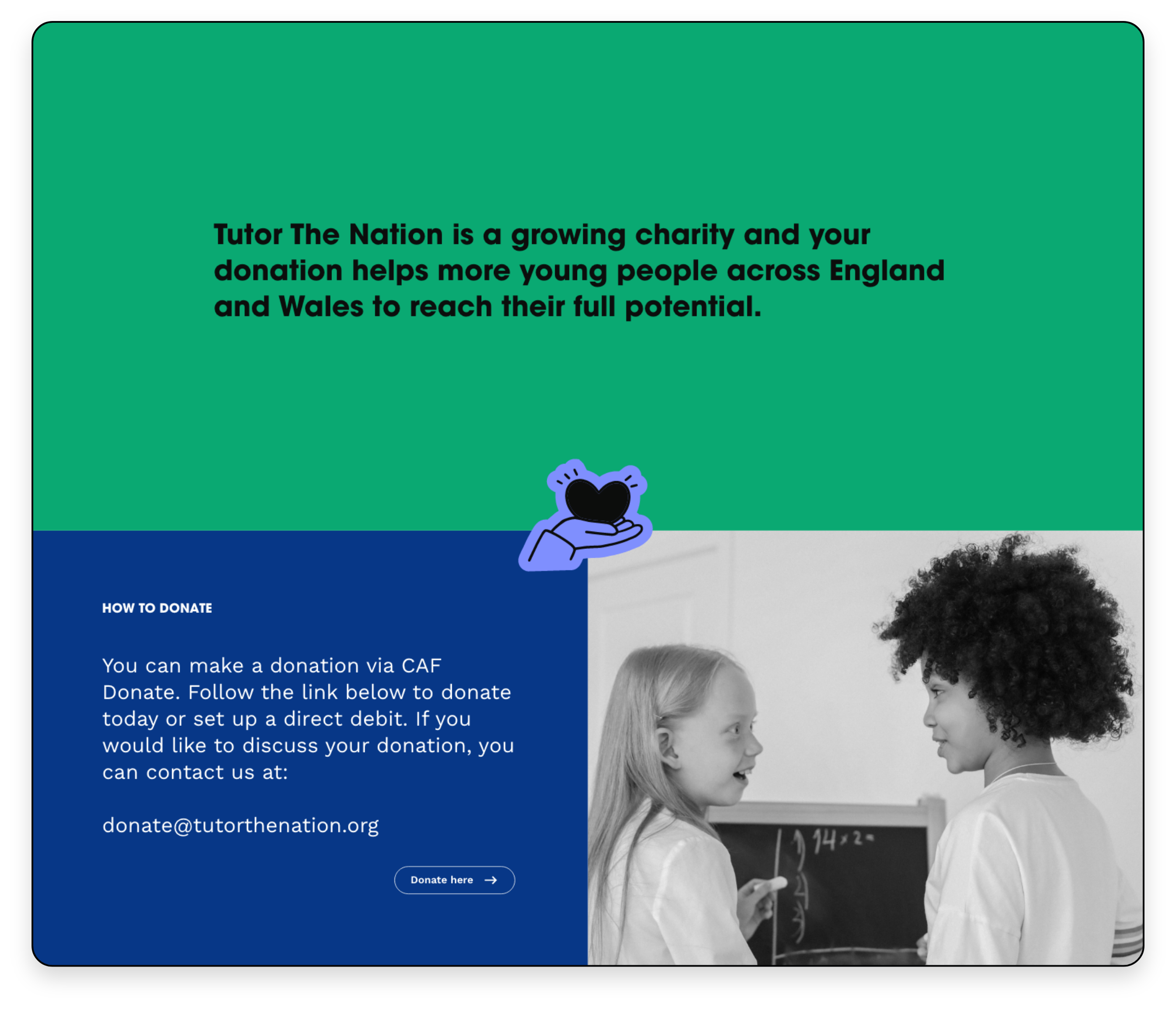
Tutor the Nation is an organisation that aims to bridge the gap in education by offering free tutorage to under-privileged students by pairing them with volunteers from universities across the UK.
Client: Tutor the Nation
Agency: Drew London
Branding & Digital: Sasha Beattie
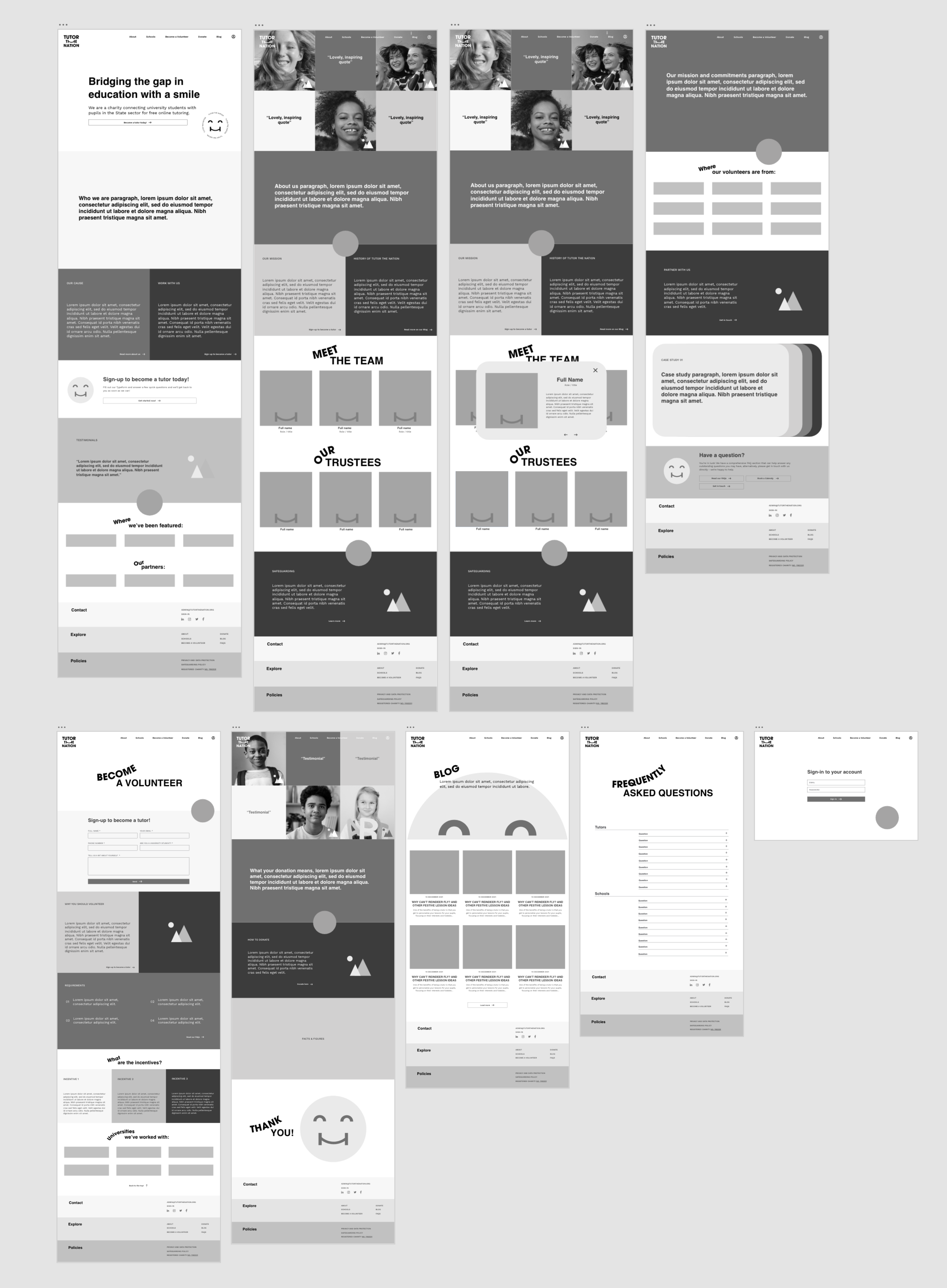
Product design (UX/UI)
Branding
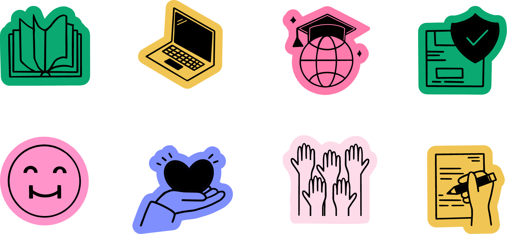
Illustration