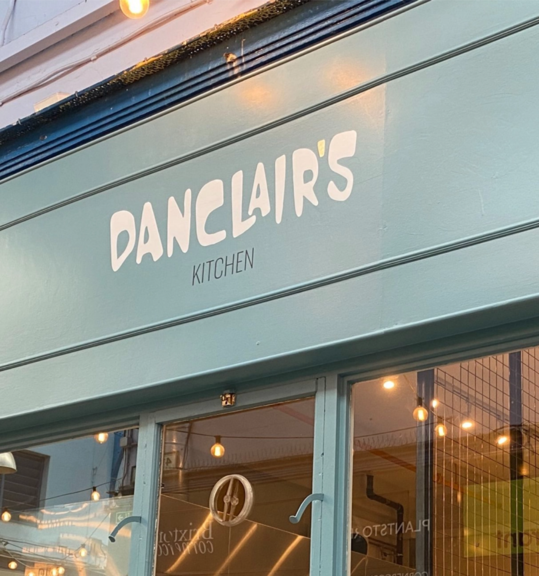
Inspired by Brian’s grandmother (Valentina), the love they shared, and the encouragement she bestowed onto him. Brian travelled the world creating heaven-like dishes bringing the best of his global cuisine back to Brixton. Each dish telling a story taking the customer on a journey.
Client: Brian Danclair
Agency: Drew London
Branding & Digital: Sasha Beattie
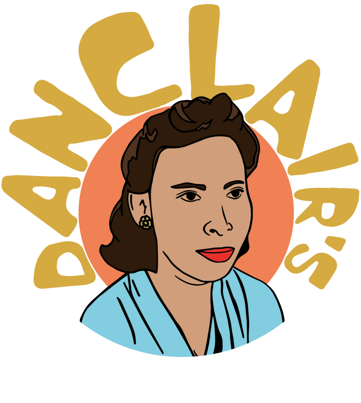
Danclair’s is experiential, eclectic and cultured. Paying homage to Valentina, I created an illustrated emblem-style logo inspired by vintage travel pins to echo the international feeling Brian wanted to bring to his menu with the restaurant name haloed over Valentina, enshrining her into the restaurant she inspired.

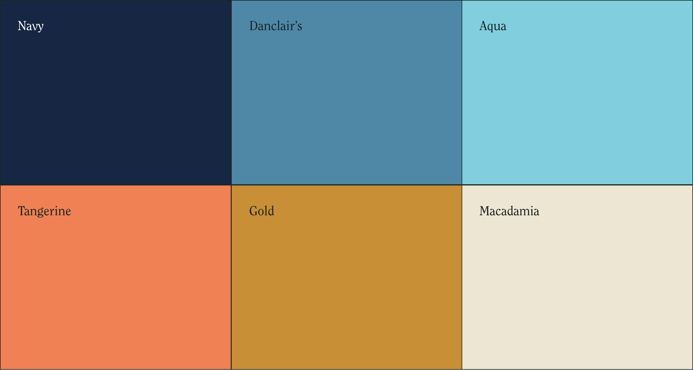
Inspired by the beautiful mural painted in the main dining area, the colour palette is breezy and rooted in nature.
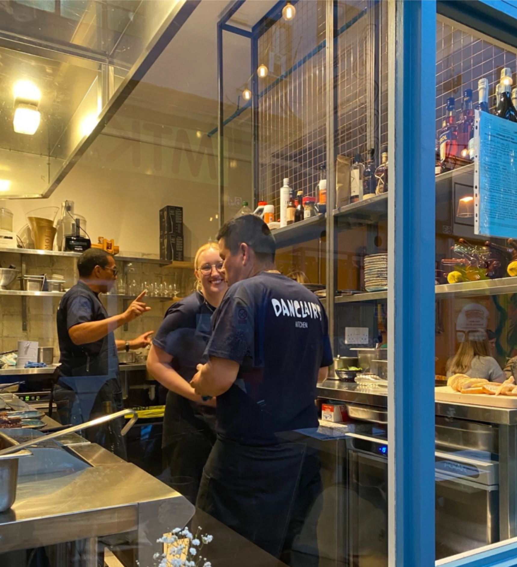
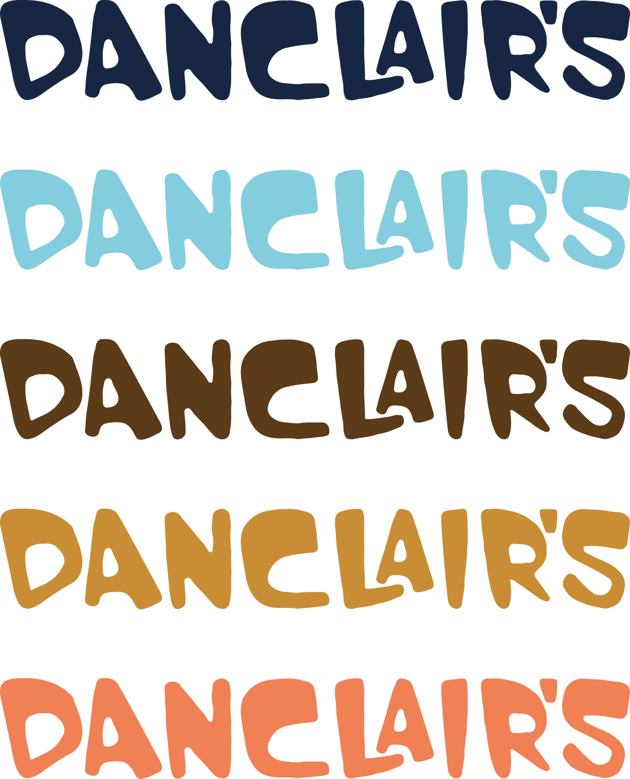
Danclair Sans is a bespoke typeface created exclusively for Danclair’s to encapsulate the emotive themes of the restaurant. The shapes are imperfect, fluid and organic.
The letters appear to be dancing - loose, full of character and unique like the cuisine!

My process started with a rough sketch moving into a higher-resolution image by collaging different elements, like the typeface, with an illustration to get more of a feel for what the end product would look like – then finishing the design by combining the illustrated portrait of Brian’s Grandmother with the bespoke typeface for the final emblem.